By Tech Powered Dad | September 17, 2014
Over at R-Bloggers a few days ago day, I came across a post from Norm Matloff, professor of computer science at UC-Davis. The post, Good for TI, Good for Schools, Bad for Kids, Bad for Stat, had been reposted from his blog, the Mad (Data) Scientist. Throughout this post and the one that preceded it, Statistics: Losing Ground to CS, Image Among Students, Matloff made the case for R in the AP Statistics classroom.
Until I read this post, it’s been pretty rare for me to hear someone make a serious case for R as an exclusive language that should be implemented in an AP Statistics class. I have seen software packages such as Minitab, SPSS, Fathom, DataDesk, and a couple of others suggested, but I don’t hear much talk about R, nor have I seen it implemented alongside any AP Statistics texts, unlike the other pieces of software mentioned. In addition to making the case for R, Matloff made a pretty strong case against the use of TI calculators.
Dr. Matloff included several arguments in his case against TI calculators and in favor of R in the AP Statistics classroom: R is free, while TI calculators are costly. R can produce colorful graphical displays that will engage kids that TI calculators cannot. The superior results that will come from R compared to TI calculators can be obtained without any substantive programming.
With all due respect to Dr. Matloff, a noted expert in data science who literally wrote the book on R, I have to be honest, his post touched a nerve.
Having spent the last two years implementing the first AP Statistics course at the school where I teach with Texas Instruments technology, and having spent the last 4 months completing all 9 courses of the Johns Hopkins Data Science Specialization on Coursera using R (and currently serving as a community teaching assistant for course 6 of that sequence, Statistical Inference), I feel like I’m in an unusual position to offer a response to Dr. Matloff’s posts. I would venture to guess that I’m part of a fairly small pool of people using both R and TI graphing calculators on a daily basis. Certainly, it is the understatement of the year to say my skills as a data science novice pale in comparison to his, but I don’t see any mention on his blog of practical experience with high school students, so perhaps I have one up on him there. I’m sure the world looks a little different from a UC-Davis classroom, full of undergraduates that have an average ACT score of close to 30, and probably even higher among students of computer science and statistics, than it does from Morton High School. Despite being a regular member of the Chicago Sun Times top 25 public high schools in Illinois and recently named Newsweek’s 150th ranked high school nationally, our adolescent population that dwells among the cornfields of rural Central Illinois can’t even come close to that (average ACT of 23 at last check).
Let me preface my remarks by saying that my experience with R over the last 4 months has been nothing short of outstanding. With each passing week as my proficiency with R has grown, I’ve only been more impressed with the capabilities of R and the extensive community that surrounds and supports it. That said, at the risk of playing into Matloff’s assumption that “the biggest source of resistance would be the AP Stat teachers themselves,” I believe R is fundamentally the wrong tool to teach AP Statistics in almost every situation. This has little to do with current College Board testing policies and nothing to do with a fear of embracing new or different technologies. It has everything to do with the student population that a teacher encounters in a typical AP Statistics classroom, and a need to implement the simplest tools to address statistical concepts that are quite challenging to that population, as opposed to adding a layer of technological complexity.
I’m going to try to address what I believe are the misunderstandings that would lead one to believe that a non-GUI based tool for statistical analysis like R would be appropriate in an AP Statistics setting.
Misunderstanding the Audience
First, it’s important to understand who is taking an AP Statistics class. I have a pretty good idea what gifted math students look like at the high school level. I frequently teach honors courses, and have been my school’s AP Calculus BC teacher for the last 3 years. My math team students have won numerous awards, including the 2012 Illinois state championship.
I would love to tell you that my AP Statistics students are the most gifted mathematical minds in the school, but in my experience, most are not. While students can sign up to take AP Calculus concurrently with AP Statistics, that’s a tough sell for kids trying to potentially cram in other AP science or foreign languages courses as well. While a few students do take both, a more apt description of most AP Statistics students comes from the official College Board course description:
For students who would otherwise take no mathematics in their senior year,
AP Statistics allows them to continue to develop their quantitative skills.
This accurately describes my experience so far. Most of my AP Statistics students would otherwise not take a math course their senior year if this class were not offered, and many of them view this as their final course in mathematics, assuming they achieve a passing score on the AP test.
- AP Calculus usually attracts the students who have been “A” students in “honors level” math classes the 3 previous years and plan to go into engineering, physical sciences, pre-med, mathematics, or business. Our AP Calculus students most often attend “tier 1” schools like the University of Illinois or Purdue University, and occasionally truly elite schools like the University of Chicago or Northwestern.
- AP Statistics usually attracts the students who have been “B” or “C” students in “standard level” math classes the 3 previous years and plan to major in nursing, psychology, history, and other social sciences and humanities. These students are more likely to enroll in less selective schools like Southern Illinois University or Illinois State University or spend a couple of years in community college before attending a 4 year school.
What’s wrong with this? In my opinion, nothing, other than that I’d like to see more of those calculus students “double up” and take both classes. The students are simply responding to what they see when they look in college course catalogs. They register for the class that they’ll have to take their freshman year of college if they don’t receive AP credit. The future engineers know that Calculus I is a requirement for their freshman year of college. The future psych majors know they have to get freshman statistics out of the way.
Keep in mind how challenging this makes the job of the AP Statistics teacher, however. Breaking in the troops at the beginning of the year is a struggle. At this point in the year, many students struggle with concepts that could be taught in moments to a more sophisticated audience. We’re currently working on very simple topics like mean vs. median with a skewed distribution and understanding a 5 number summary, and many of them are crashing right now.
It’s true that the College Board could tear down the curriculum and start over, making AP Statistics a course primarily for future data scientists rather than primarily for future humanities and social science majors. This would have a devastating effect on the number of students enrolled in the class, however, since very few students are planning a future in statistics/analytics/data science around the age of 17. Furthermore, I have found that there is most certainly enough challenge and rigor to keep top students engaged and prepared for future statistical endeavors. I’m quite confident the handful of brilliant mathematical minds I did have in last year’s class could have gone on to success in Johns Hopkins’ Dr. Brian Caffo’s Statistical Inference course on Coursera, a course that many students in the JHU Data Science Specialization have struggled with.
I know from my experience last year that I will eventually have this year’s group humming along on hypothesis tests and the like. My 42 students that took the AP test at the end of the year had a 3.4 mean (national mean was 2.85). That translated to six 5’s and most of the rest scoring a 3 or 4, but it was a very long and difficult process to get there. When it comes to technology, I need tools that they can just pick up and use. I can’t afford for them to feel any more alienated than they already do at this point in the process, which takes me to my second point.
Misunderstanding the Level of Computer Literacy Students Bring to AP Statistics
My students think they are tech savvy. They’ve got their iPads, their iPhones, their PS4’s. They are on Facebook, Snapchat, YouTube, Twitter, and just about every other social media service you can think of. However, in my experience, their technology experience rarely goes beyond what allows them to communicate with their friends, play games, and possibly prepare a report or presentation using Word, Excel, or PowerPoint. Every year, I ask all of my students in all of my classes if they have any programming experience. If I’m lucky, I get one student per year answer in the affirmative, regardless of how many honors sections I’m teaching. They don’t even know what HTML is, let alone a functional programming language.
The idea that we’re just going to jump in with R the way we do with our graphing calculators is simply not realistic. I’ve been delighted with how R has allowed me to generate graphics, examine data sets, and much more. The course in machine learning I took through the JHU program has opened up my eyes to new possibilities. I probably thought about using R with my students half a dozen times this summer, but each time I played out the scenario in my mind I came away chuckling at the thought. There are already so many struggles with statistical concepts for the kids, even when using a ridiculously simple point and click interface (more on that below), that I can’t imagine that I would also become their very first exposure to coding as well. For kids who sometimes struggle with simple spreadsheet concepts, how much harder would it be to accomplish the same tasks coding on a data frame in R?
Perhaps things are different in the technology Mecca that is California. However, my guess would be that my students, in a middle class, white collar town in Middle America, are pretty representative of AP Statistics students nationwide.
Don’t get me wrong, I’m not happy about the state of computer literacy in my school. My district is among the many that have jumped on the trend of issuing iPads to every student. There’s been staff training on how to use the iPads as a polling device, to distribute documents, collect assignments, communicate homework problems, etc. Frankly, I’m a little confused about how a piece of technology that is primarily designed for content consumption will prepare our students to be content creators. How will such a device help our future artists learn computer based graphic design? Why not choose something that would allow our future communications majors to easily work with WordPress and HTML? Don’t tell me about the iPad workarounds for these tasks (and many others). I’ve tried them, and they are awkward at best.
And yes, how can an iPad be considered a strong choice for teaching students basic programming? It can’t. The sad truth is that learning to code isn’t a part of our school curriculum anywhere. Should it be? Absolutely. Would I like to see it integrated into AP Statistics? Sure, in an ideal world, but it’s unrealistic and unfair to expect the AP Statistics teacher to step in and be a student’s first and only exposure to coding.
Misunderstanding the Costs Involved with Using R as Regularly as a Good Teacher Uses Graphing Calculator Technology
For large portions of the school year, my students use their graphing calculators just about every day. On the first week of school, we transferred about 30 data sets onto their calculators that are used extensively throughout lectures. They all participate by opening those data sets on the spreadsheet feature on their handheld and then analyzing them with the data and statistics feature set. Other times students will ask questions that prompt spontaneous calculator demonstrations from me that allow my students to follow along. I would conservatively estimate that we use them for 100 days out of the 170 day school year, but it’s probably higher than that.
I honestly don’t know what a college statistics classroom looks like nowadays. Perhaps all of the instruction for every class takes place in a computer lab. Perhaps students simply bring a laptop with them to class every class period. To recreate what I do with graphing calculators, I’d need to have one of those scenarios come to fruition in my classroom. Sadly, my school is not going to provide me with a classroom set of computers, nor is it going to require students to purchase a laptop for their AP Statistics class. The expense of either of those scenarios is far greater than that of TI graphing calculators.
On the other hand, the students have all had a graphing calculator since their first Algebra class as freshmen. They’ve already spent several years using the calculator for analyzing functions and its dynamic geometry features This means there is no additional cost over that initial purchase, which comes to about $30 per year over the course of their four years in high school, or about half of that on a used device.
(Probably) Misunderstanding the Capabilities and Ease of Use with Newer TI Technologies
Oftentimes, when I read articles from college professors and/or technology bloggers outside the educational sphere, I see information like the Washington Post article Dr. Matloff cited, The unstoppable TI-84 Plus: How an outdated calculator still holds a monopoly on classrooms. I supposed I’m jumping to conclusions a bit here, but since the TI-Nspire is not mentioned by WP author McFarland and since Matloff’s other post seems to suggest that he believes the TI-83 is the defacto choice of AP Statistics teachers, my assumption would be that they are not very familiar with TI-Nspire technology. Perhaps they are not aware of what a push Texas Instruments has given their much newer (and better), modern graphing calculator at professional development conferences like T3 (Teachers Teaching with Technology, TI’s teacher training conference series).
It’s true, the TI-84 family does have tremendous momentum that’s been hard to turn. TI is a victim of its own success, and many teachers are now either unable to change due to financial constraints or unwilling to learn a new platform. I’m very sympathetic to the former problem, less so to the latter. That said, many teachers and schools that stay current with technology jumped ship on the 84 for the best TI had to offer in the Nspire years ago and would never go back. Here in the Peoria metropolitan area, not exactly an area known for rapid adoption of technology, 4 of the 5 districts I’m aware of that offer AP Statistics use the TI-Nspire, not the TI-84 (or God help us, the TI-83, which is woefully inadequate for statistics education). Despite years of experience with the TI-Nspire when I started teaching AP Statistics, I was still amazed by how easy to use and powerful the platform was for the content of an AP Statistics course.
Let’s compare a few tasks in the popular Bock, Velleman, DeVeaux AP Statistics text, Modeling the World, on the TI-Nspire and R. All of the screen shots of the TI-Nspire that follow came from the TI-Nspire Teacher Software. However, what you see on the screen is identical to what a student in my class would see on their TI-Nspire CX handheld calculator, color and all.
One problem asks students to compare a data set involving battery life of brand name and generic batteries. Students are asked to begin by comparing the two types of batteries with a horizontal boxplot.
First, on the TI-Nspire, we label the columns brand_name and generic and fill them in with the data values, a method of organizing data students should already have some familiarity with from spreadsheet programs such as Excel.
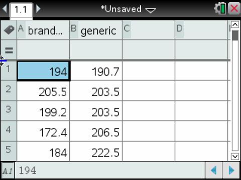
Next up, open a data and statistics window. Select “click to add variable” at the bottom of the screen and add brand_name. Click menu and change the plot type to box plot.

Right click at the bottom (ctrl menu with the handheld) to add another variable and select generic and complete the plot.
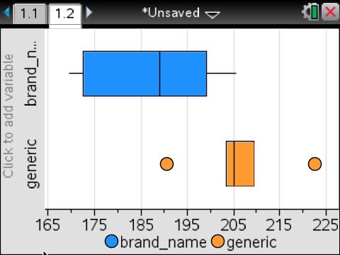
Let’s generate the same plot with R. Start by storing the data in two variables and creating a data frame.
<br />
generic<-c(190.7, 203.5, 203.5, 206.5, 222.5, 209.4)<br />
brand.name<-c(194, 205.5, 199.2, 172.4, 184, 169.5)<br />
batteries<-data.frame(generic,brand.name)<br />
Now generate the boxplot.
<br />
boxplot(batteries, col=c("orange","blue"),horizontal=TRUE)<br />
legend("topright", fill=c("blue","orange"), c("brand name","generic"),cex=.7)<br />
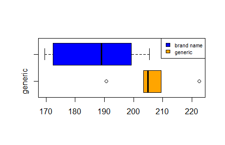
Notice that to get a “nice color graphic”, the Nspire handled all of the formatting of colors, the legend, etc. whereas I had to give R a lot of detail about what I wanted to see or get a very plain plot. Conversely, if I want to customize those options, I’m out of luck with the Nspire, but in a classroom setting, I can’t think of a time the students have ever needed to do so. Texas Instruments’ team has already done a nice job thinking through how I’m going to need to present these graphics in an AP Statistics setting.
Let’s move on to the second task required of us by the BVD text. We are asked to perform a 2-sample t interval at 90% confidence. Of course, at times we do calculate such confidence intervals by hand in AP Statistics, but other times we are more concerned by simply interpreting a result given by the technology of the class. That’s how we’ll do it now.
First, with the TI-Nspire, open a calculator window. Using the menu button, select Statistics, followed by Confidence Intervals, followed by 2-Sample t interval.
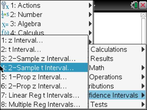
From here it is a matter of selecting data to let the Nspire know that we’ll be pulling our values from a spreadsheet and selecting the appropriate options for the confidence interval.
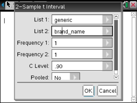
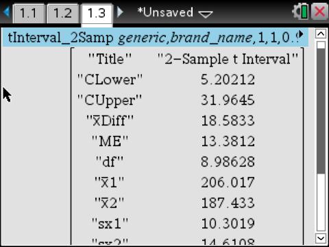
It’s true that the R code looks very succinct, a single line.
<br />
t.test(generic,brand.name, var.equal=FALSE, conf.level=.90)<br />
<br />
Welch Two Sample t-test<br />
data: generic and brand.name<br />
t = 2.5462, df = 8.986, p-value = 0.03143<br />
alternative hypothesis: true difference in means is not equal to 0<br />
90 percent confidence interval:<br />
5.202122 31.964545<br />
sample estimates:<br />
mean of x mean of y<br />
206.0167 187.4333<br />
However, I think it’s pretty clear that the point and click interface of the Nspire will be more intuitive to the uninitiated. Unconvinced? Another BVD problem asks students to re-express a skewed data set related to the heart rate of penguins and the duration of their dives using logs.
Here’s how you would tackle it with the TI-Nspire. Load in the values. The process is the same as before.
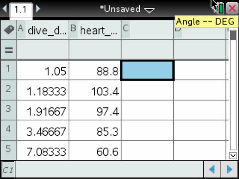
Create a new column, which I called log_heart. In the formula box underneath the column name, press “=”, select log, and evaluate the log of heart_rate, which can easily be typed out with the letter keys or quickly called from a dropdown menu of all defined variables with the “var” button. After pressing enter, you’ll have the log of the entire heart rate column.
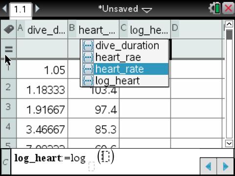
I’d like to see if I achieved any sort of symmetry with this re-expression, so I’ll open a data and statistics window. Click “add variable” at the bottom of the screen to add our new log_heart variable. Then change the plot type just like we did with the box plot, but this time to histogram.
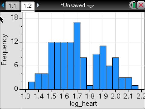
I feel pretty good about this histogram, but sometimes you need to tweak that bin width. I’m not particularly dissatisfied with this particular histogram, but because I often do have to make that change with my students, I’d like to compare how it’s done on the Nspire with how it’s done in R. Let’s see just how easy that would be for the kids on the Nspire. Go into menu, plot settings, histogram properties, bin settings, and select equal bin width.
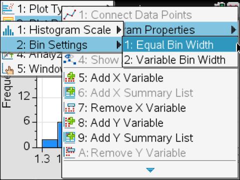
I’m going to align to 1.3 with a bin width of .075.
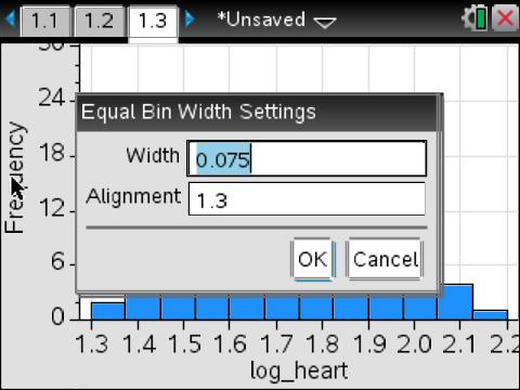
That’s it. We’re done. I haven’t pointed it out yet, but all of these Nspire graphics are “live” to the students on their handhelds. Notice here that I’ve placed my cursor over a bar, and information about the bar has been revealed. If you use the googleVis package with R, you’re already familiar with the power of this kind of interactive display. My students have access to this with every single display of data they generate on their TI-Nspire handhelds.

Now, click where you see the log_heart variable to change it to dive_duration and click “Frequency” to change it to log_heart. This will create our scatter plot. Incidentally, if you’ve never worked with the Nspire and consequently never had a chance to see the data points dynamically rearrange themselves during this process, you are really missing out. Students find these animations very engaging.

Now let’s add a linear regression. In order, click menu and follow the drop down menus through analyze->regression->show linear.
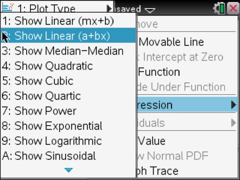
Here’s the regression that follows.
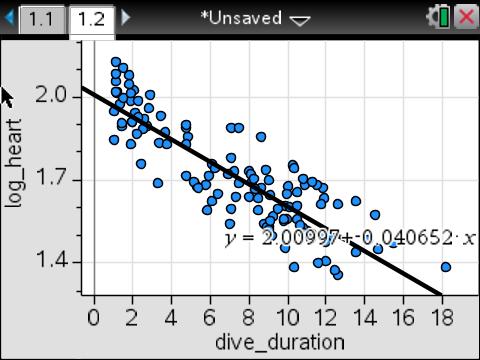
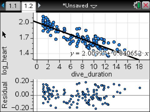
Of course, we’d have a much better idea how good a re-expression this is if we looked at the residual plot. Go back to the menu, analyze again, but this time select residuals followed by residual plot.
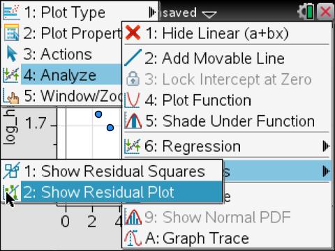
Residual plots can be hard for beginning students of statistics to connect conceptually with the original regression and data points. Fortunately, the Nspire automatically plots the residual plot below the original scatter plot and regression as a multipaneled plot for easy comparison.
Now let’s take a look at the same sequence in R. Start by loading the data sets in as two variables.
<br />
heart.rate<-c(88.8, 103.4, 97.4,85.3,60.6,77.6,44.3,32.8,94.2,99.8,104.5,78,54.2,79,42.9,134,54.1,31.8,49.4,57.1,50.2,97.3,32.3,42.1,40.2,34.6,81,44.5,106.3,36.3,87.7,24.1,47.8,44.9,45.5,47.7,49.1,43.6,68.1,51.7,91.1,34,52,103.8,34.8,36.9,48.6,43.8,52.5,67.2,48.2,52.3,40.1,83.6,55.4,47.1,48.3,104.5,54.9,41,71.5,74.7,37.7,67.8,41.1,29.6,70.5,47.1,34.1,43.3,35.8,32.7,40.3,36.2,84.4,31.3,31.3,78.5,31.5,57.5,67.8,48.5,33.7,27.5,29.9,39.2,32.1,30.3,81.3,113.6,80.9,76.6,39.5,38.8,22.8,34.3,121.7,35.5,36.3,25.5,33,111.2,30.6,119.5,28.1,73.3,39,28.5,24.2,23.5,25.3,46.6,77.1,77.5,71.6,101.8,46.8,50.6,127.8,42.1,48.4,50.8,49.6,56.4,55.2)<br />
dive.time<-c(1.05,1.1833333,1.9166667,3.4666667,7.0833333,4.7666667,9.1333333,11,1.3166667,1.4833333,1.1666667,2.7166667,7.25,4.7833333,11.866667,1.0833333,8.0166667,11.283333,8.1333333,6.0833333,9.0166667,2.3166667,10.866667,6.05,9.8333333,8.7666667,2,6.3666667,2.0666667,9.9333333,2.1166667,18.15,10.033333,9.9833333,10.5,5.2833333,5.1333333,7.3,3.35,5.9333333,2.8333333,9.0333333,4.7333333,1.9166667,7.0166667,9.2166667,7.4666667,8,6.9333333,3.7333333,5.75,8.1,10.133317,2.5833167,6.2499667,8.6333,10.84995,1.1,8.8332833,11.749933,4.8499833,3.6833167,14.48325,4.7333,12.6166,15.449917,1.05,5.36665,8.9666167,8.49995,9.7999333,10.933283,10.5166,10.483267,2.25,11.8166,12.249933,1.4643667,9.2087,2.41665,1.9333167,3.2999833,10.799933,13.5166,11.949933,9.4999333,10.833267,14.149933,1.96665,1.1,1.4333167,2.5333167,7.1166333,8.4999667,12.583267,10.683267,1.1499833,9.1166167,9.8166,11.983267,8.99995,1.8166667,11.149933,1.8499833,14.68325,2.1833333,5.8166333,9.89995,10.3666,12.399933,11.5666,8.3333333,7.0666667,7.4666667,8.6166667,2.8666667,11.816667,10.783333,1.5333333,13.533333,11.533333,8.2166667,11.3,10.283333,10.366667)<br />
Take the log of the heart rate and store it as a new variable.
log.heart.rate<-log10(heart.rate)<br />
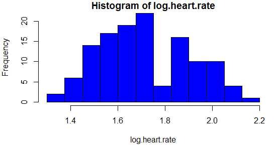
Let’s look at the histogram in R.
hist(log.heart.rate, col="blue")<br />
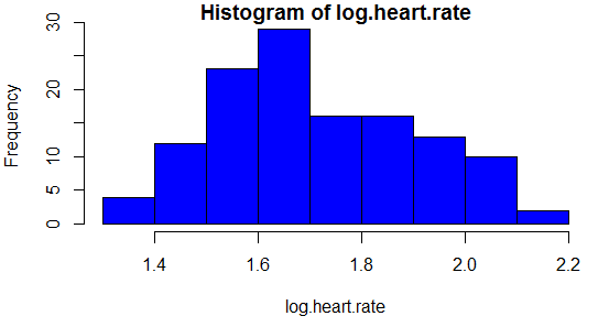
So far, so good. As with the TI-Nspire, I’d like to precisely set the bin width and alignment. We would first need to teach the kids how to program a sequence in R. Certainly not insurmountable, but it’s not really the point of this activity, and it will certainly be a conceptual sticking point for many students.
<br />
bins<-seq(from=1.3,to=2.25, by=.075)<br />
hist(log.heart.rate, col="blue",breaks=bins)<br />
And now we can see the same histogram with a different bin width.
Now, let’s prepare for the linear regression.
modelFit<-lm(log.heart.rate~dive.time)<br />
modelFit<br />
We get the following result, same as before.
<br />
Call:<br />
lm(formula = log.heart.rate ~ dive.time)
Coefficients:
(Intercept) dive.time
2.00997 -0.04065
However, if we want to see the same multipaneled plot as we had on the TI-Nspire that allows for easy comparison of the scatter plot and linear regression to the residual plot, we’ll have some prep work to do. It’s time to teach the students how to custom set graphical parameters with the par function and mfcol.
par(mfcol=c(2,1))<br />
Unfortunately, this won’t be enough because attempting to graph with the default margins will result in error messages and cut off labels. We’ll need to show them how to custom set margins as well.
par(mar=c(4.5, 4, 1, 1))<br />
From here, we can first graph the scatter plot and the our linear regression.
<br />
plot(dive.time,log.heart.rate,col="blue",pch=19)<br />
abline(modelFit)<br />
Finally, add the residual plot.
res<-resid(modelFit)<br />
plot(dive.time,res,col="blue",pch=19,xlab="")<br />
abline(h=0)<br />
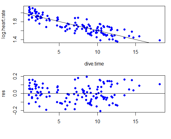
Using R, I can guarantee that the exercise of struggling through this bit of code will take most of a 48 minute class period with my students. Doing it the TI-Nspire way, we’ll spend the majority of our time in theoretical discussions about what it means to re-express with a logarithm, how to examine a residual plot, and looking at additional examples. Doing it the R way, I’ll spend almost an entire hour fielding questions about error messages and virtually no questions that are truly about understanding statistics better.
My point isn’t that any of these R scripts are particularly complicated to someone who already knows R. They’re not. My point is that by adding programming to the mix, you are adding a layer of cognitive complexity to problems and concepts that are already very complex to the typical AP Statistics student. And after months and months of explaining over and over what N(0,1) means and constant reminding that we don’t call y-hat “y boomerang” (I couldn’t make that up if I tried), a person begins to realize that the symbols of statistics already seem like a foreign language to many beginning statistics students. Why add another burden on top that will only feel just as foreign to them?
Does the TI-Nspire have the statistical capabilities of R? No one could make such a ridiculous statement with a straight face. However, it is just as ridiculous to suggest that the average student is going to pick up even these basic sequences of R code as quickly as they would the TI-Nspire. Having worked with high school students for 13 years, I can tell you it won’t even be close. The Nspire’s point and click interface guides them through a series of choices under consideration for solving the problem. Should they be doing a hypothesis test or confidence interval? 1-sample or 2? Is this a normal distribution or Student’s t? As a result of the GUI, error messages are infrequent and easy to interpret when they do occur. There’s no need for students to call up the documentation to get the code right. And ultimately, what is the goal of AP Statistics, to teach coding, or to help students understand and conceptualize introductory college level statistical concepts?
Conclusion
I’m sure that some data scientists would like to see AP Statistics take on a more rigorous form, letting students custom code graphical displays with ggplot2 and making all of their analyses reproducible. This is probably also true of some mathematicians who would like to see AP Calculus incorporate more elements of a real analysis course. Who doesn’t love a good epsilon-delta proof, right? R can absolutely be the right tool of choice for those instructing the future data scientists of the work force. I enjoy working with R every chance I get. However, just as AP an Chemistry course is not full of future chemists, and AP History is not full of future historians, AP Statistics is not full of future data scientists. These students, many of whom already find statistical concepts a battle, need technology that makes concepts as accessible as possible so they can spend their time grappling with statistical concepts and not struggling with code.
I’m certainly not here to say that the TI-Nspire is the only technology that can work for AP Statistics. However, with this level of student, both in terms of their mathematical maturity and their knowledge of technology, I am strongly for a GUI based solution, not a code based solution. That’s not R, so while R is an outstanding tool for data science, it’s the wrong tool for AP Statistics.

