By Tech Powered Dad | April 7, 2011
After about 6 weeks of hype, TI-Nspire OS 3.0 has finally arrived. I was a bit surprised when I learned Texas Instruments was going to release OS 3.0 before the new color TI-Nspire CX was available. I suppose it could make the CX release seem a bit anticlimactic.
That said, I’m glad TI went this route. I appreciate when tech companies make the product available as soon as it’s ready to go. Keeping in mind that I’ve only had hands on access to TI-Nspire for a few hours, here’s a brief trip through what I’ve found in 3.0 so far, using a TI-Nspire CAS touchpad. If you’re not on a CAS, I would expect some minor variations on what available. Don’t worry, the big stuff like 3D and pictures is on both versions.
3D, Pictures, and More

There were a number of features that were made well known prior to today’s release. As promised, the release does include 3D graphing, the ability to get pictures on your calculator, Vernier’s new Dataquest App, and new calculus and statistics features. It’ll take me a while to sort through all of it. Here are a few first impressions.
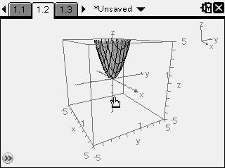
3D graphing is easy to use. You just open up a graph and change view to 3D graphing. I don’t think it looks quite as sharp as it did on the computer demo I saw, but it’s still ahead of the TI-89 Titanium and Voyage. My guess is that it’ll look quite a bit better on the CX.

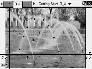
I’m having issues getting TI-Nspire Teacher Software to upgrade on my home computer (UPDATE: TI contacted me to let me know that if you have a “non-7 zip archive” error, the problem is fixed–just download the software again), so I haven’t fully been able to try uploading my own images. However, OS 3.0 does come with a preloaded picture of fountains. Like the 3D graphing, it is very cool, but my guess is that the image quality is going to be substantially better on the CX.
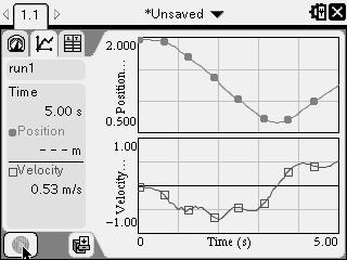
I do happen to have a motion detector, or CBR, at home (don’t ask why), so I was able to give a very brief test of Vernier DataQuest. Very, very cool. The Nspire autodetected it and even offered to import data stored on the CBR from the last time I used it months ago. I love how the information is organized on the screen. DataQuest is another feature I can’t do justice to in a paragraph.
Arrow Keys and Those Nice Touches

I may be the only one to get excited about these kinds of things, but there are some less well publicized features that I think are great. I don’t know how many other people were annoyed by the fact that some of the set up menus required you to use the left and right arrows when intuitively, it seemed like you should use the up and down arrows. That’s gone in 3.0, and good riddance. Also there are just some other small but nice touches with the graphics. When you scroll the icons on the home screen, the one you’re currently pointed to enlarges slightly. It feels very Web 2.0. I also have had problems with settings going back to default (from degrees to radians) when the handheld was reset in the past and that problem appears to be gone.
Time to Hurry Up and Wait

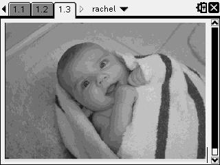
While the arrival of the new OS is a huge leap forward for the grayscale TI-Nspire, it’s just the appetizer in this meal. As excited as I am about showing off my daughter on an Nspire, we are all still anxiously awaiting the release of the color TI-Nspire CX. The last I heard from TI, we can expect it around the end of April. I know there is a lot of excitement around the release. I had to chuckle when I had a few students tell me they want to camp out at Office Max for the CX as though it was a new iPhone release.

