By Tech Powered Dad | December 4, 2013

UPDATE: Several of you posted more information about TI-Nspire OS 3.6 on the Tech Powered Math Facebook page. As usual Adriend Bertrand of TI-Planet already has a great story up on 3.6. Apparently, it was first available for download in mid-October. In addition to the changes I had already noticed. Readers pointed out some additional changes. The calculator app now alternates shading light and dark on equations to make them easier to read. You can also double click on the graph itself to bring up the entry line. TI representatives spoke about the changes to the operating system in a webinar they recently conducted. Thanks to everyone who shared information on the new OS.
Earlier today, I received an email from a reader in Indiana, alerting me that there is a new version of the TI-Nspire operating system not yet posted on the publicly visible part of the Texas Instruments website, but accessible to him nonetheless. This teacher claimed that his school had recently obtained a couple of the new style TI-Navigator systems, and when they arrived, they contained a new version of the TI-Navigator computer software, version 3.6.
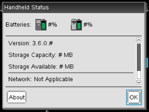
As coincidence would have it, my school has a couple of Navigators that arrived just before Thanksgiving too, but I’ve been too busy to crack open those boxes. Obviously, I unsealed them right away after to further investigate this, and sure enough, the enclosed CD-ROM was labeled 3.6. I used it to upgrade the existing Navigator software on my PC. As soon as I did this, I received a warning that the new version of the Navigator software would not work with any TI-Nspire handhelds that had not been upgraded to TI-Nspire 3.6. Luckily, the Navigator software was happy to complete the upgrade process for me, which went just as smoothly as all of my Nspire upgrades have in recent years.
After doing the upgrade, I’ve played around a bit with my handheld TI-Nspire OS 3.6. I’ve reached out to Texas Instruments for confirmation about what has been changed in this version of the OS and will update this article if they offer any information. For now, I’ve only noticed a couple of changes, neither of them earth shattering.
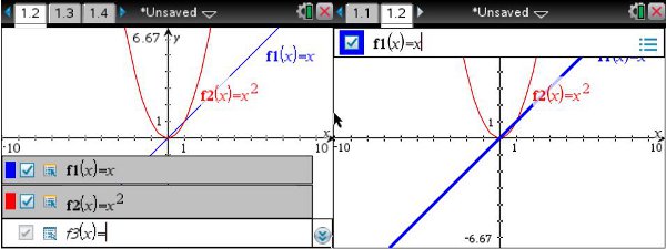
The more significant change is graphing. The equation entry line has been moved from the bottom of the screen, where it’s been since the Nspire was first released, to the top of the screen. Additionally, it’s been simplified a bit. You can only see one function at a time now by arrowing up and down through them for by clicking on the icon in the upper right and using the touchpad. It appears that the ability to expand the entry line to see all functions at once is gone. Additionally, you can’t change the graph line style from the entry line any more. You’ll have to use control + menu.
 TI-Nspire OS 3-2 Graphing on Left, OS 3-6 Graphing on Right
I don’t mind the change on the line style, but I will miss the ability to see all of my functions at once. Perhaps too many people complained that the entry line obscured the view of the graph when it was expanded, but I liked to have them all up at once on my Smart Board for discussions with my students.
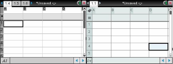
The other change I noticed is tiny but very welcome. In a spreadsheet, the Nspire dev team added small icons, a label and an equal sign, to make it clearer where to name a column and where to put the formula for a column. I’ve seen students reverse these two a lot, and I think this will definitely reduce confusion.

 TI-Nspire OS 3-2 Spreadsheet on Left, TI-Nspire OS 3-6 Spreadsheet on Right
As I said, if I become aware of more information about OS 3.6, I’ll update this article. If you’ve updated to 3.6 and have noticed changes not mentioned here, but sure to add them to the discussion on the Tech Powered Math Facebook page.

